Overview
Pre-built, embeddable widgets that bring Vitable's benefits experience into your application.
Vitable Drops are ready-to-use widgets you can embed directly into your application. Each Drop handles a complete user experience — authentication, UI, and data flow — so you can ship benefits features without building them from scratch. Embed Flexible HRAs, primary care, and benefits administration directly into your platform.
Available Drops
Section titled “Available Drops”Employee Dashboard
Section titled “Employee Dashboard”The Employee Dashboard widget gives your employees a full benefits experience — enrollment, appointments, qualifying life events — inside your application. Requires an employee-bound access token.
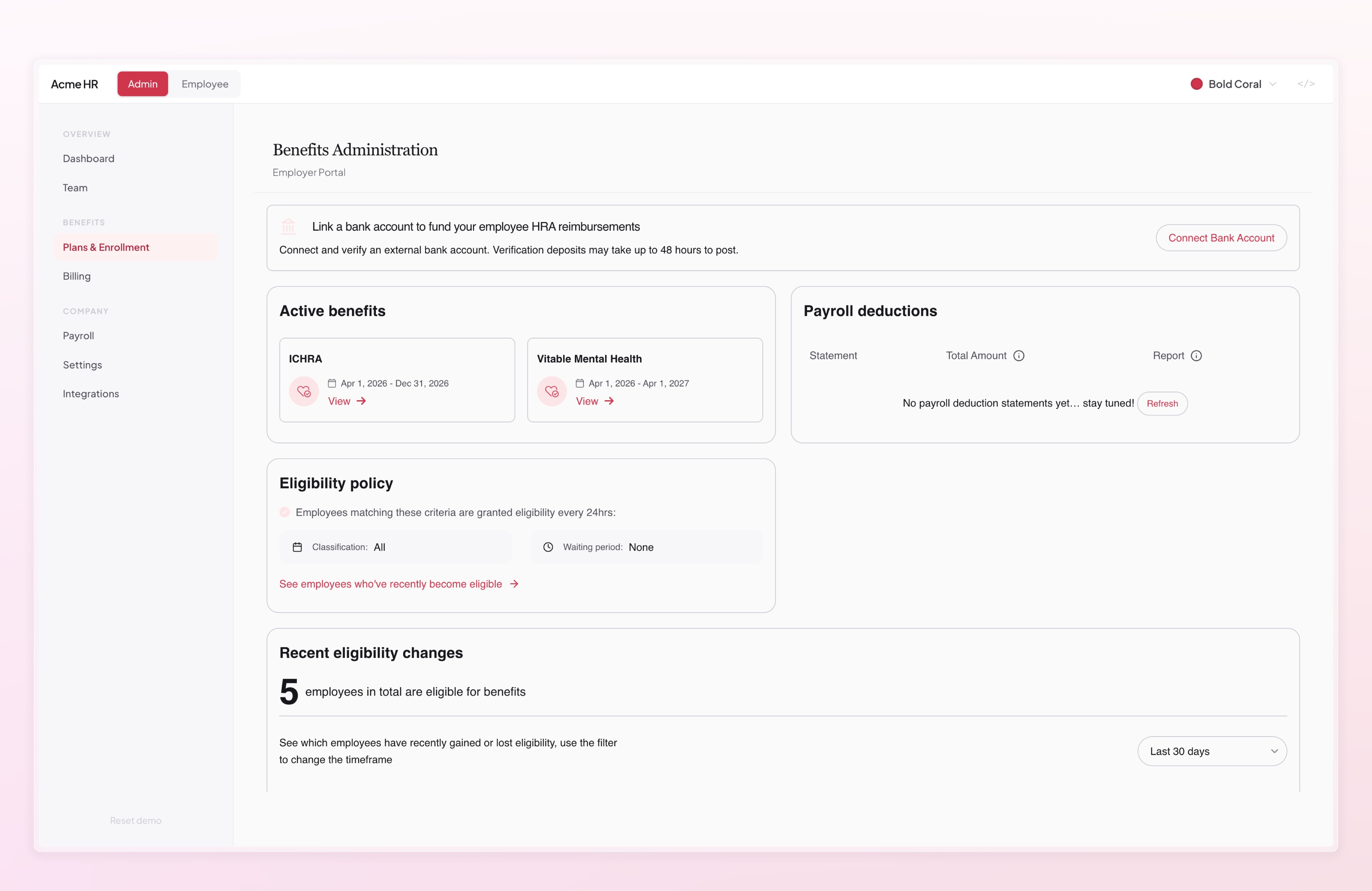
Employer Benefits
Section titled “Employer Benefits”The Employer Benefits widget gives your customers’ HR teams a benefits administration dashboard — view employee enrollments, manage plan assignments, and monitor coverage. Requires an employer-bound access token.
Employer Billing
Section titled “Employer Billing”The Employer Billing widget gives your customers’ HR teams a billing management dashboard — view invoices, track payments, and review billing history. Requires an employer-bound access token.
Theming
Section titled “Theming”Every Drop supports theming through the VitableConnectProvider. Pass a theme prop to customize colors, fonts, logo, and color mode so the embedded experience matches your application’s look and feel.
import type { VitableTheme } from "@vitable-inc/drops/core"
const theme: VitableTheme = {  fontFamily: '"Inter", sans-serif',  primaryColor: "brand",  colorMode: "light",  colors: {    brand: [      "#eff6ff", "#dbeafe", "#bfdbfe", "#93c5fd", "#60a5fa",      "#3b82f6", "#2563eb", "#1d4ed8", "#1e40af", "#1e3a8a"    ],    gray: [      "#f8fafc", "#f1f5f9", "#e2e8f0", "#cbd5e1", "#94a3b8",      "#64748b", "#475569", "#334155", "#1e293b", "#0f172a"    ],  },  logoUrl: "https://your-cdn.com/logo.png",}
Theme Properties
Section titled “Theme Properties”| Property | Type | Description |
|---|---|---|
fontFamily | string | CSS font family for all text |
primaryColor | string | Key into the colors object that identifies the primary palette |
colorMode | "light" | "dark" | "system" | Color mode for the embedded UI |
colors | Record<string, string[]> | Named color palettes — each is a 10-element array from lightest to darkest (hex format) |
fontSizes | { xs, sm, md, lg, xl } | CSS lengths for the type scale |
lineHeights | { xs, sm, md, lg, xl } | CSS lengths for line heights |
logoUrl | string | HTTPS URL to your logo image |
Theme updates are applied in real time — if your app supports theme switching, the embedded widgets will update automatically when you change the theme prop.